So now we can look at how we actually do the georeferencing. This happens as a multi part process, and explaining the steps gives you an understanding of how it all works.
The basic of georeferencing a historic aerial photo, is that by aligning it to a current aerial photo, of which we know the area that it covers, we can make the historic photo cover the same area as that current aerial photo. So this makes it easy to trace or otherwise reference features from the historic aerial photo and see a comparison with the current aerial photo. In NZ Rail Maps I use the historic photos to trace, for example, old closed branch lines, bypassed sections, and old yards and buildings at stations. This gives me a documentary record of historical features of a rail corridor and these features are displayed on the resulting map.
We do the georeferencing by using Gimp’s transform tools to overlay the historical image over the top of the current image, or a grid of images (tiles), that cover the same area as the historical image. In practice we usually have multiple historic images in each Gimp project file, that cover multiple stations or yards, or a continuous length of corridor (most commonly in an urban area, where there can be lots of points of interest between stations, such as sidings). For example, in the five main centres, I have created Gimp projects that cover continuous corridors for a section each. The Auckland corridors are at present up to 10 km in each Gimp project each because they only have one historic layer. Christchurch corridors created so far are only a few km each because they have multiple historic layers from different eras. It doesn’t take much distance working with originals of resolution 0.075 metres and NZR survey images of 1:4350 scale to start adding up to gigabytes of disk space in a Gimp project, when just one 4800×7200 background tile has 34 million pixels in it.
The overlaying is the tricky and slow part. We have to try to make as many features on both the current background image and the historical overlay image line up as we possibly can. For a variety of reasons this can be difficult. The major one is perspective distortion. When a photo is taken, with any type of camera, the subject is most accurately rendered where it is directly aligned to the centre of the camera’s lens. At any other point of the image, the camera is effectively looking at that part of the subject from the side, and the resulting distortion gets worse the further you go out to the side of the lens. On a typical photo taken on the ground, there isn’t really an issue with that. But when the image is taken for the purposes that an aerial photo is taken for, where we want to get an accurate representation of what is on the ground below, and given the distances incorporated in each photo, the distortion makes that difficult. That’s a key reason why adjacent photos in a survey run are given a big overlap. You could get a really accurate aerial view by taking the centre most piece of each photo and joining it to the centre most piece of the next photo which would be easy with the amount of overlap on, for example, the NZR station surveys. I could actually do this, but so far, I have just used every second image. Because of the distortion, overlapping features that go above the ground like buildings are difficult. So are features that are on hillsides. The most challenging ones from a rail perspective are where a railway line on a raised embankment runs next to tracks that are on the flat, such as in the Dunedin railway yard where the main line is raised, and the technique for that is to have two copies of the historical image, one for the raised and one for the flat area, overlay each one just for the raised or flat features, and then overlap them using masking.
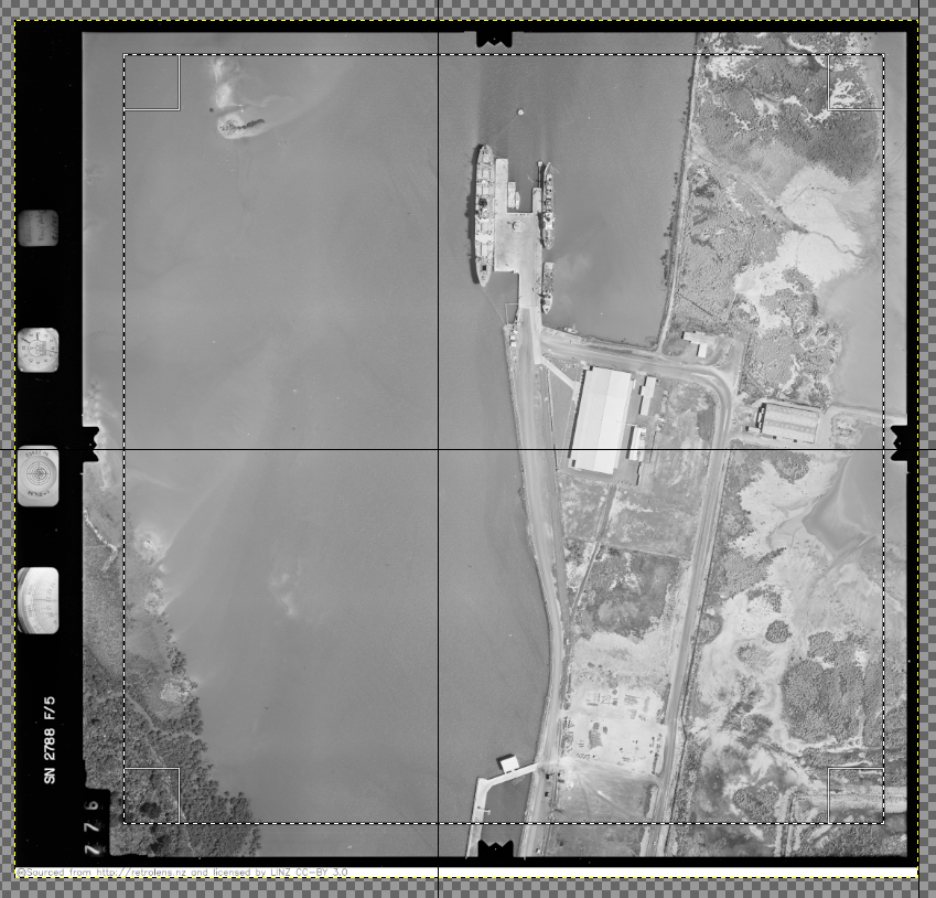
OK let’s get started. Typically the layer list will show your Retrolens aerial photos at the top of the list, and the base imagery from Linz down the bottom of the list. So that your historic aerial photos are always drawn on top of the base images. Here is a typical Retrolens image that you’ve downloaded and imported into Gimp. First thing is to rectangle select it, and crop off the edges (shown here with the rectangle selection in place).
Using Layer menu, Crop to Selection. Repeat this for every layer in the stack that is the same size. Change the selection rectangle if you have layers that are different sizes or have different borders. The borders being of no use to us.
Next step is to do the overlaying, one layer at a time. First, check that Snap To Grid is turned off in the View menu. It gets annoying when you are trying to precisely position a layer and Gimp is snapping it to a side of the grid. Also, there will still be a selection active from the cropping stage. Go to the Select menu and choose None to make sure there is no current selection.
Back in the day, with earlier versions of Gimp, you would have to use different tools to perform the overlay task. When I started using Gimp, I used the Scale tool to size the overlay, which doesn’t have any preview capability, so I would just try scaling by trial and error until I got the correct size. As you can imagine this was very time consuming. Next step after that would be the Rotate tool, to get everything to line up. After a few months I discovered the Unified Transform tool. This is a new feature in Gimp 2.10 and it combines the function of both these tools and it offers a full preview, which lets you do the lining up. We recommend to make things easier, set up the keyboard shortcuts mentioned in Part 3 to enable you to quickly change preview opacity, canvas rotation, and zoom level.
Select the Unified Transform tool in the toolbox. Then select the first layer in the layer list and click on it. Your layer will be displayed as a preview frame, with a pivot (a circle with crosshairs inside it) in the centre and various handles at the corners and along the sides. Familiarise yourself in the documentation about how to use these handles. Now click somewhere within the layer preview and drag it to somewhere over the base imagery. Look for a feature that is common to both layers. Then drag the pivot from the centre of the preview to the common point on it. My favourites for common alignments are the ends of bridges, or a set of points, but often I use road features as well. It only has to be approximate at this initial stage. Once you have the pivot in place on the preview frame, set the opacity to zero and drag the entire preview frame so that the pivot sits over the same place on the base imagery. Then increase the opacity and confirm the pivot is properly located.
One caveat that is important when doing a unified transform. If you press the wrong key on the keyboard, it may start the transform before you are ready. This is an annoying feature in the current version of Gimp. Many’s the time I have pressed the wrong key on the keyboard and the transform starts before I am ready.
In the above photo, we have positioned the preview of 2788-D-1 over the appropriate place on the base imagery, with the pivot very near the top centre, lined up on the end of a railway bridge.
Once the pivot is in place then decrease the preview opacity to about 50% and use the most convenient resize or skew handles to drag the preview to fit the underlying base imagery. To make this work off the pivot, go to the Tool Options dock and ensure that under “From pivot” the Scale option is checked. This makes sure everything else scales centered around the pivot when you drag those handles. Then resize the preview and try lining some other features up in both images. Use the opacity adjustments to compare the preview and base as much as needed and adjust the preview position and size to suit.
Youll see there are stretching (square) handles at the corners of the preview as well as in the middle of each side. But what if you need to have one in another place closer to where you are working with the canvas zoomed right up and the nearest one is out of the view? This is where the Readjust feature comes in. Press that button and you’ll get a new frame right where you are viewing at the moment, instead of one around the full preview. Just note that the pivot moves too, to the centre of the new frame, and most likely you’ll want to drag it back to where it was before.
Somewhere along the way you’ll want to recheck the pivot position to make sure the preview is properly lined up there as well. If you need to adjust the preview position at the pivot, then check if you need to redrag a side or corner handle to resize the preview and line the rest of it up again. I usually try having the pivot as close as possible to the top of the preview, while I am resizing at the bottom-most side. For the Retrolens layer 2788-D-1 I initially chose to line up on the railway bridge over Walton St. The bridge has been lengthened since 1975, because the road it crosses has become a roundabout, which makes it tricky to line up on. I really need to check against something else on the ground that it will line up. And because it’s raised above the ground, the tracks lower down might not line up so well. After a lot of checking, I realised I needed to move my pivot to a different location, because the southern end of the bridge was just not the right place, because the bridge was extended at that end. But the north end of the bridge was not right, either. Eventually I decided the best option was to line up on the next bridge further north (Water St) which meant adding an extra base tile at the top of the canvas and increasing canvas height.
Once you are sure you have the preview lined up as best you can over the base image, check that interpolation is set to the right setting in the Tool Options dock (I use Cubic), then click the Transform button and away it goes. When the Transform has completed, the next thing that is important to do is to lock the position of the transformed historic layer, so that it can’t be accidentally dragged out of place on the canvas, because unlike the base tiles, it isn’t aligned to the grid in any way.

The finished result after overlaying the first historical tile for Whangarei railway station, which is Survey 2788, run D, photo 1, over the Linz 2014 0.1m base imagery for the area. The main railway yard is about half covered by this historical image. Meaning that the join onto the next historic layer, D 3, would be highly visible as it would be across multiple tracks. One way to avoid this would be to use a different layer to start with (like maybe D 2 instead of D 1) that would push the edge out, and another way is to exploit the overlap itself and use a bit of masking to move the join to a different part of the overlap.
In this case I went ahead with D 3 without any masking and managed to get a nearly perfect overlap, as you can see below. But there have been plenty of times when it hasn’t been quite so smooth.
An overlap is going to be less than smooth when there are rail wagons or service buildings across it, for the reasons I mentioned near the top of this post. And sometimes, there is simply too much distortion to make it ever work. In this case, it looks perfect across the rail yards, but further out, across suburbs and houses, there are bits of buildings cut off and misaligned, as shown below.
In this case, because the rail yard ended up near perfect, I didn’t bother checking the result further out. The reality, as I mentioned above, is that quite often it is impossible to get a perfect alignment all the way across an aerial photo. I could have worked on improving the alignment towards the edges and then the rail yard would have been misaligned.
Gimp has got better over time, with the readjust feature (a result of a feature request I made on the Gimp forum) making it much easier to get perfect alignments across joins. I’ll look at the challenges of doing this in Part 5.